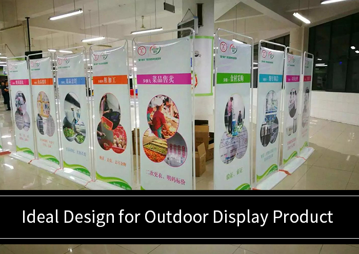
Ideal Design for Outdoor Display Product
In this article, you will learn about ideal design for Outdoor display product. Outdoor display is part and package of the advertising drive of a business house. There may not be a single business whether big or small that has not resorted to this set of promotion for their business.
Most businesses have even various kinds of advertisements and keep renewing them from time to time too. They pay a lot of time and money into it just to advertise their products. But the impression of each is varied and it will mostly based on what the content, text, image, font, size, viewability and the like is.
1. Traditional still gets Eyeballs
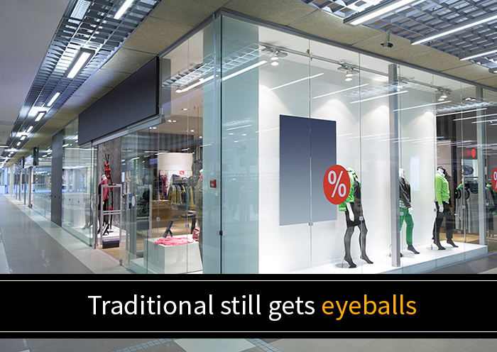
Certainly, digital is the route to go today yet the traditional methods of using flex banners, billboards and the like have not lost their shine. But in fact, they are the better ways of advertising used by most of the businesses even today.
It is found that these boards, when set at strategic locations, have a tremendous impact on the buyer’s mind. They, in particular, have the potential to change the decision of the buyers too.
2. Concise yet Detailed

The first is the content. It should not be longspun that it penetrates the person. It should not be too brief that the viewer makes no head nor tail of it. Thus it has to be short and accurate and you can go by the formula less is more here.
It has to tell everything yet cover most of it. The viewer should be fascinated by the words and feel that he or she has to buy it. This should be the impression created. The next to form a visual impact is the image. Admittedly, an ad devoid of at least a couple of images are not considered to be that attractive.
The image requires to tickle the funny bone of the viewers. This sort of image creates the highest amount of impact. This can be some well-known cartoon character or some other image of the product or service put in a little humorous or charming way. These get more attention than a straightforward or simple image.
3. Contrasting yet Matching
The image and content should meet each other. Contrasting each other may not have a sound impact on the viewer. Putting both in an interesting manner and creating a surprising element will leave an extraordinary imprint on the mind. This will force the viewer to think about it even when the advertisement is out of his or her purview.
Then the color of the image/images must be eye-catching too. Putting dark colors can accumulate more attention from far too. But making it look too trending may reap some attention but may not end in a conversion. This can affect in a negative way by putting off the customer and he or she can lose interest in buying the product.
4. Right size Right Impact
The size of the font of the letters and the size of the images play an essential part in how it creates an impression on the minds of the viewers. First, you need to determine where the flex banner is to be set up. Then measure the optimum distance from where the viewer is going to view this.
The longer the distance is the bigger the size of the text has to be. The font size of the text of different content can be modified. The biggest may get the first heed. So what has to harvest the first attention can be put in the biggest font. Other content can be printed with a little smaller font.
These fonts can be inconsistent too with bold, italics, color or sizes too. This variation also can create an impact and garner more attention. But it should not be discarded with too much that the can leave the viewer a little perplexed.
5. Create the Right Impression
The goal of outdoor advertising in
All these need to be put in size and colour that has decent visibility. The size of the ads need to be enormous when viewed from far and can be small or midsize when viewed from nearby.
Also, the colours of both image and text should not be too flashy nor too faint that they are not visible from far. The colour contrast of the text and images need to be great and impressive to create the right influence and not dominate each other.
